Email and Social Cross-Promotion: How One Company Does It
I received this email in my inbox a month ago, and knowing what the subject line referred to (the subject line was “Let’s be friends”), I got excited.
I’m a huge advocate for promoting email on social channels via adding the link in bio and vice versa, so this email really caught my eye. I wanted to see how a larger company did it, perhaps learn a couple of things. I was eager to open this email,but my excitement quickly faded when I didn’t see a call to action above the fold; in fact, I had to scroll through SIX paragraphs just to find the call to action and a payoff!
It got me thinking that if a company as large as Kiss My Face can make these mistakes, so can other businesses. So here’s my analysis of this email and improvements that can easily be made.
Let’s start at the top, shall we?
Subject line: Let’s be friends
I loved this. I knew exactly what to expect when I opened the email.
From line: Kiss My Face
Again, great. I know who it’s coming from. I know I have opted-in to get their emails.
Design:
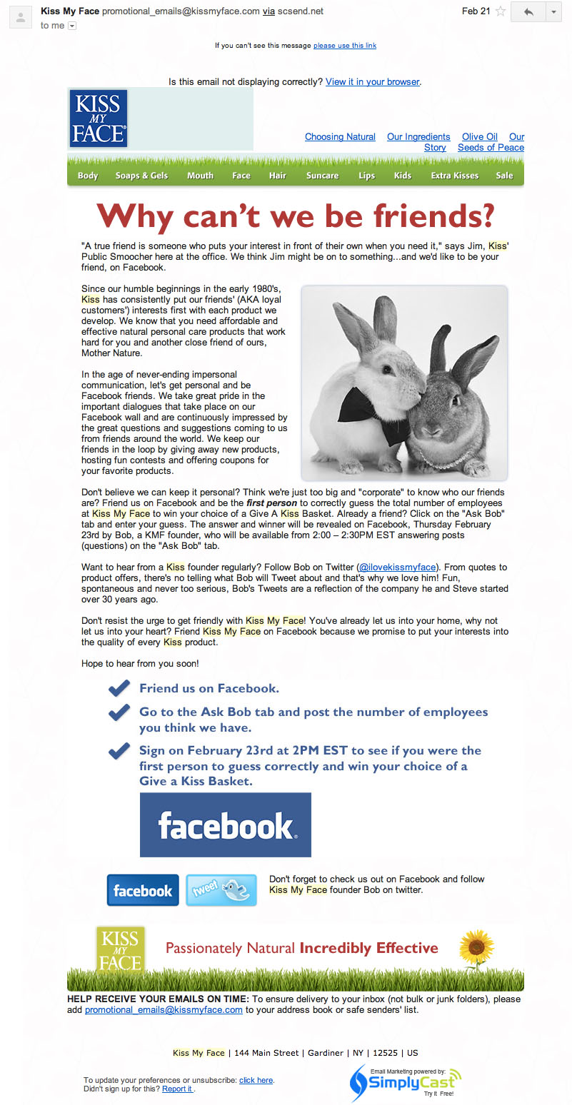
In Gmail at least, the background isn’t appearing and the top navigation — Choosing Natural, Our Ingredients, Olive Oil, Our Story, Seeds of Peace — is not stylized at all. In the ‘view in browser’ version they work fine.
This is where the testing conversation starts. You can never test too many times. You can never test in too many browsers. You can never test in too many email clients. In fact, if you use a tool like Litmus [link: litmus.com], then all your tests are in one place. If you can’t afford Litmus, at least hit the major browsers and email clients before you send your email.
I’m not sure what the bunny photo has to do with their brand. It’s cute, sure, and I get that the bunnies are “friends,” but that’s where the relationship ends for me.
Also, the logos on the top and bottom are in different colors. Is there a reason for that? I am a stickler for consistency, and I don’t see the point in having one blue and one mustard.
The call-to-action area (above the Facebook logo) is the same color. Change the colors and fonts so that my eye is drawn to the giveaway promotion and the founder’s Twitter handle.
Content:
This is where I have the biggest beef. There is just SO MUCH content; pare it down. The email starts out with a quote from an employee.That’s fine; it’s a cute intro and draws us in. Next is a history of the company — um, isn’t that on your website? Push me over there to read about it if I’m interested.
The third paragraph talks about how much they love interacting on Facebook. Okay, this is the perfect opportunity to put a link to the Facebook page here, but wait! If that happened, then I would have missed the fourth paragraph. This is where things get interesting.
The fourth paragraph talks about a promotion they are running: If you become friends with them on Facebook AND guess how many employees they have, you can win a gift basket of products. It’s a cute concept, but I would have missed it if I hadn’t read the entire email.
Takeaway:
I don’t know about you, but I get a lot of email. So reading more than a couple of paragraphs is enough. If you do your job well, your content teasers will be so well-written I will want more information and will click to your site to learn more.
The biggest takeaway from this analysis: Don’t make the payoff so hard. Make your call-to-action easy to find, above the fold. Your readers will thank you for it.
About the Author: Monica Sims is the Senior Manager of Social Media and Email Marketing at iContact, a division of Vocus. She can be reached on Twitter at @photosims
- 5 Alternative Email Calls-to-Action - February 7, 2023
- Ignoring Usability When Selecting an Email Service Provider is a Giant Waste of Money - May 17, 2022
- Email Marketing: Master Basics Before Bodacious, Please! - April 21, 2020


1 Comment
by Gigi
So true, all of it. Thanks for your insights!