Using Intrigue in Email Marketing
Back in the day when I used to go to the mall for fun (it was called growing up in the 80s and 90s before online shopping), Brookstone was one of my favorite stores. Not because I bought anything—in fact, I’m not sure I’ve ever actually purchased something from Brookstone—but rather because they had 5 or 6 massage chairs out at all times for “testing”.
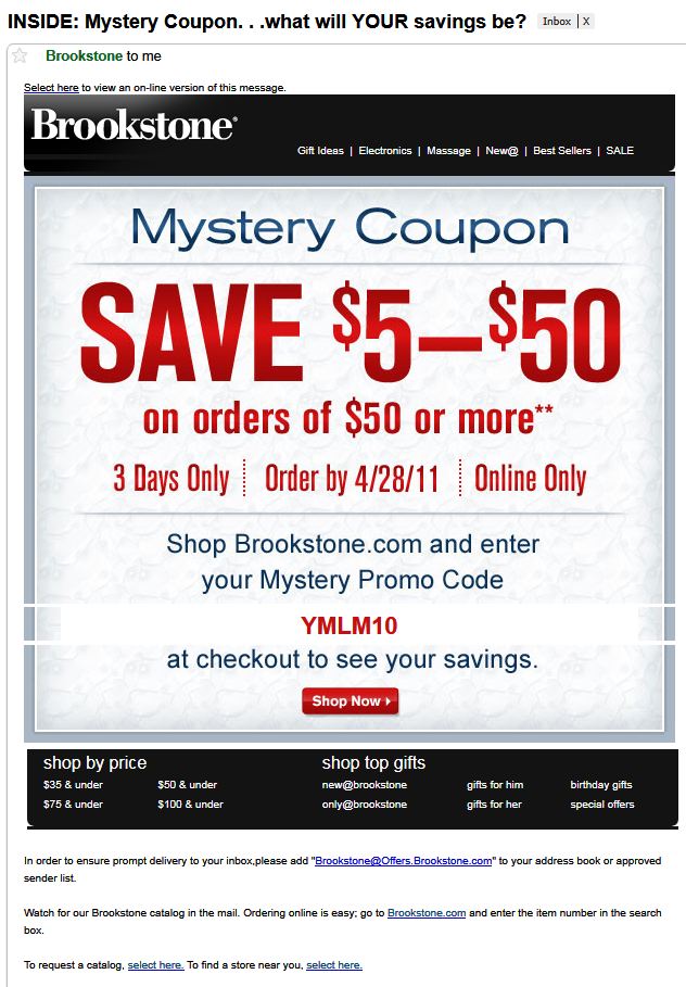
That sort of intrigue led me to sign up for Brookstone’s email marketing program a while back. A few weeks ago, they sent me the message below (with images on):
With images on, this message is pretty cool. Here’s what I like about it:
- Subject Line: Everyone likes a good mystery. And the subject line sells the mystery, plus provides the incentive to open the message by having “INSIDE” as the first word out of the gate.
- Design and Content: The design here is simple. The offer is front and center, with no real competition. Content is clear and decisive. The limitations of the offer are explicit. Well done.
- Call-to-Action: The call-to-action is easy to find. I will admit it could use to be a bit larger, maybe at least matching the text size of the “3 Days Only” line. Just one man’s opinion there.
- Surrounding Links: Brookstone has always known they are a unique gift store, and the links in their emails point to that understanding. I particularly like the two menu categories at the bottom of the message that allow their price shoppers and their item shoppers easy access to what they’re looking for. Again, well done.
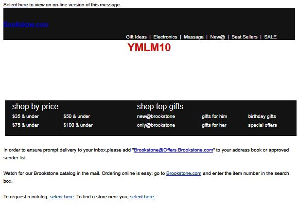
With images off, there are some issues with the message. Here’s what I mean:
- Blue link text over a black background doesn’t work very well for an alt-text version of the logo.
- The offer is apparently all image with the exception of the promo code. All image and no alt-text means that the offer truly IS a mystery, but not one that people will click through.
- Losing the “Shop Now” entirely is a big problem as well. Brookstone should have used alt-text for that at the very least.
The moral of this story: using intrigue to get opens and clicks can be very effective, particularly if what you’re selling is worthy of said intrigue. But make sure you execute flawlessly both with images on AND off.
About the Author: Scott Cohen is Vice President of Managed Services at Inbox Group. He also writes on email marketing, fatherhood, sports, and politics on ScottWritesEverything.com.
- 5 Alternative Email Calls-to-Action - February 7, 2023
- Ignoring Usability When Selecting an Email Service Provider is a Giant Waste of Money - May 17, 2022
- Email Marketing: Master Basics Before Bodacious, Please! - April 21, 2020


4 Comments
by Scott Hardigree
Great observations Scott! I also noticed that Brookstone should be coding their emails with the tag to avoid the white space between images in Gmail.
by Andy T
Nice review of this email Scott!
One thing that occurrs to me is, it appear that there is only one call to action in the email but the instruction (“shop now >”) is not until the bottom of the giant image, although presumably the entire image is click-able. So you have to load the image and on a small screen/preview pane scroll down or view in a browser.
In order to allow people to convert quickly and without the images on too, I’d suggest adding before the view in a browser link, in the preheader, a call to action elaborating on the subject line. This way people can convert quickly without having to faff about to see all the content and get the promo code. This can also help with the snippet text in Gmail/iphone etc.
Alternatively if it’s vital for the brand to make people load the images to get the promo code and know what to do with it, make loading the images or viewing in a browser a bit more of a call to action in the preheader to increase engagement.
What do you think?
by Dewane Mutunga
The sad part is a lot of companies are making these mistakes and I have an inbox full of proof. Blunders like this make you question just how much they’re testing emails before going out, if at all.
Nice observations Scott!
by Scott Cohen
Scott: Excellent point about proper coding for the white space!
Andy: It’s all about making it easy for the recipient to act on the desired action, right? Great points about using the preheader and snippet text better. Couldn’t agree with you more.
Dewane: Thanks for the kind words. Hopefully reviews like this can help marketers think about these types of things.